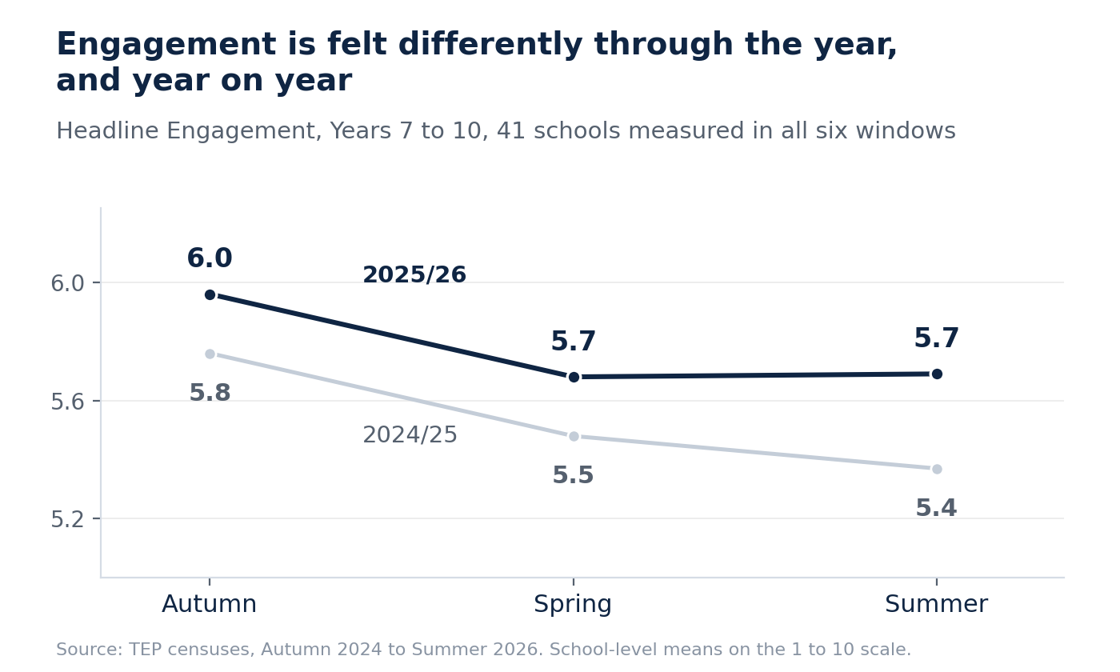
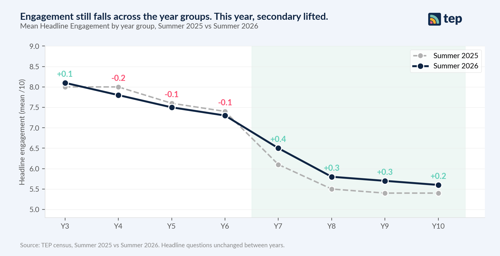





Every term we run a census across the schools we work with. Summer 2026 gave us five findings worth sitting with. They move from the shape of the year, into where drift happens within it, into attendance and gender, and finish with a pattern we saw across schools that measure both pupil and employee engagement.
Below is what we found, and what we think it means for school leaders.
Finding 1. The curve holds. Secondary lifted at every year group.
The engagement curve from Y3 to Y10 keeps the shape it has always had. Primary high, then the Y7 to Y8 cliff, then flat through KS4. That shape is durable year on year, and it is one of the most reliable patterns in our data.
What changed this year is small but real. Across TEP secondary partner schools, every year group scored higher in summer 2026 than in summer 2025, by between 0.2 and 0.4 points. Primary saw small dips of a similar size. The shape of the curve did not move. The whole thing lifted, at secondary.
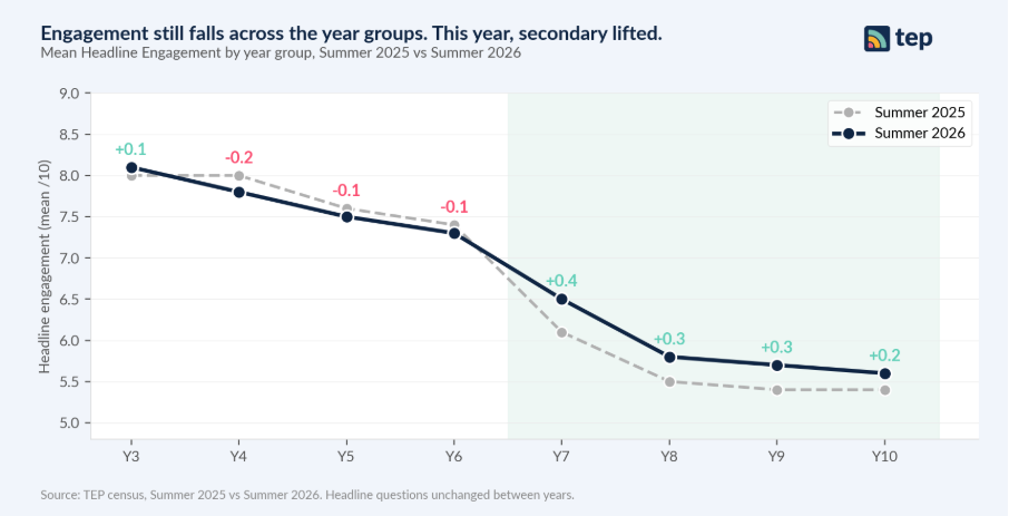
Figure 1. Mean Headline Engagement by year group, Summer 2025 vs Summer 2026. Y11 omitted (n<500).
The Y7 to Y8 cliff is where most of the secondary decline lives. If a school can hold Y7 engagement into Y8, the whole KS4 story changes. Small movements at secondary in the right direction are worth understanding.
Finding 2. Every year group drifts. Y7 falls furthest.
The curve is the shape of the school system. But within any single year, engagement drifts. Between autumn 2025 and summer 2026, engagement fell in every single year group we measure.
Y7 loses the most: 0.9 points across the year, from 7.4 in autumn to 6.7 by spring, and 6.5 by summer. That is more than double the fall of any other year group.
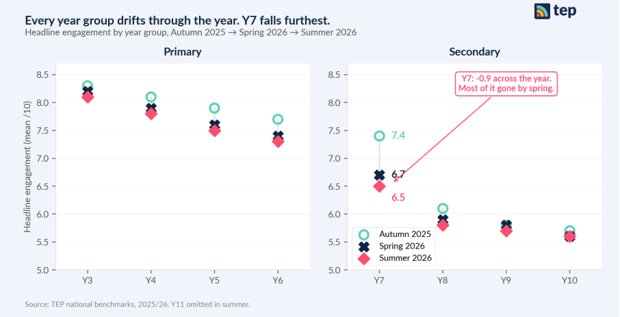
Figure 2. Headline Engagement by year group, Autumn 2025 → Spring 2026 → Summer 2026.
The other thing this chart shows is when Y7 falls. Most of the 0.9 point drop is in place by the spring census. Y7 pupils arrive on a high, and lose it inside the first two terms. The action a school takes in spring is likely to matter more than what it reads in summer.
Finding 3. Healthy attendance can hide your least-engaged pupils.
New this year, we link live attendance data to engagement. At secondary, pupils below 90% attendance report headline engagement 0.8 points below pupils at 95% or above. That gradient is steepest in schools with otherwise strong overall attendance.
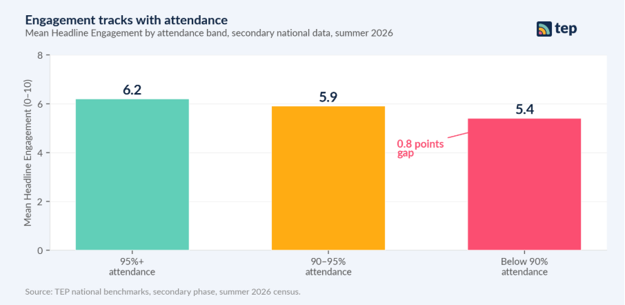
Figure 3. Mean Headline Engagement by attendance band, secondary national data, summer 2026.
This is the value of looking beneath the whole-school average. A school with a healthy headline attendance figure can still have a smaller group of pupils whose engagement is dropping and whose absence is already showing up in the register. Whole-school averages will not surface those pupils. A demographic filter will.
Finding 4. Girls lead at primary. Boys lead at secondary.
At primary, girls score at or above boys on almost every engagement driver. By secondary, the pattern reverses on every single driver we measure. This is not new, and we have written about it before. What has stayed with us is the size of the gaps at secondary and where they sit.
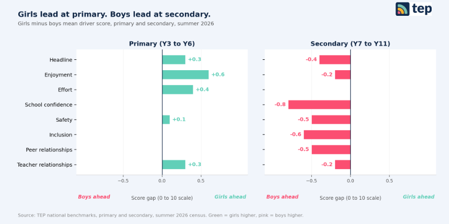
Figure 4. Girl minus boy engagement gap by driver, primary vs secondary, summer 2026.
The widest secondary gaps sit on school confidence (0.8 points below boys), inclusion (0.6 points below), safety and peer relationships (0.5 points each). These are the drivers that describe how a school feels day to day. Girls at secondary report a very different experience of school life to their peers at primary, and a materially different one to boys their own age.
Finding 5. Where employees are more engaged, pupils are too.
For the 340 schools that measure both employee and pupil engagement with us, the two move together. The correlation sits at r = 0.60 in primary and r = 0.62 in secondary, across 183 primary schools and 157 secondary schools.
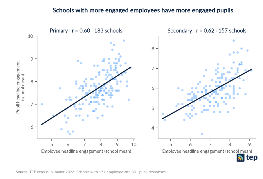
Figure 5. Pupil headline engagement (school mean) plotted against employee headline engagement (school mean), summer 2026.
This is correlation, not causation. It does not tell us that engaged employees cause engaged pupils. But it is one of the strongest school-level patterns we can see, and it holds across both phases. That is worth sitting with. A school planning its improvement priorities may want to look at its adult culture with the same seriousness it looks at its pupil data.
What this means for schools
Engagement is a lead indicator. It shifts before attendance, attainment and retention do. Which means the summer census is one moment in a longer conversation about where a school is going and what to look at next.
If we had to pick a place to start, it would be the intersection of Y7, spring, and the pupils showing up in the bottom of the engagement distribution. That is where the fall is steepest and the window for action is shortest.
And if we had to name the strongest single pattern we saw this term, it would be the one on the last chart. Not because it proves anything, but because a pattern that holds across 340 schools and both phases is one worth understanding better.
If you would like to see how the summer 2026 findings look in your own data, get in touch. We are happy to walk through them with you.